
The Best Interior Paint Colors for Small, Dark, or Low-Light Rooms
· By Fernando Maciel
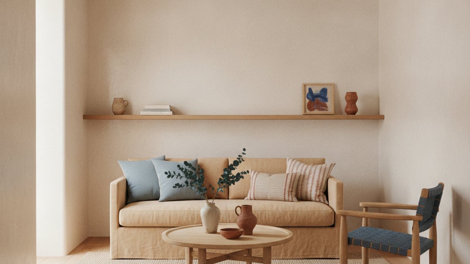
A small or dark room is one of the trickiest spaces to paint well. The instinct is to reach for a crisp bright white to open it up, but the wrong white can read cold, flat, and even gloomy once it is on all four walls, especially in a room that never gets much direct sun. Color behaves differently in a low-light space than it does on the paint chip under store lighting, and that gap is where most disappointing repaints come from.
The good news is that the fix is mostly about understanding light and undertones, not about finding one magic color. This guide covers the warm whites and soft neutrals that actually reflect light, why undertones matter so much in a shaded room, how ceilings, trim, and sheen change the feel of a space, and the single most important step most people skip: testing samples on your own wall, at different times of day, before you commit.
Why small and dark rooms need warm light-reflecting colors
The job of paint in a small or low-light room is to bounce whatever light the room does get back into the space. Lighter colors have a higher light reflectance value, which simply means they reflect more of the available light rather than absorbing it, so a pale wall makes a cramped or dim room feel more open and airy. That is why very dark, saturated colors on every wall tend to make a small room feel smaller and even darker, even though a moody deep color can look stunning in the right, well-lit space.
The catch is that not every light color works. A stark, cool, bright white can actually make a low-light room feel colder and more clinical, because with little natural light to warm it up, the blue and gray in that white takes over. In a room that already feels dim, that reads as gloomy rather than clean. This is the most common mistake homeowners make: assuming the brightest white will automatically brighten the darkest room.
The reliable answer for most small and dark rooms is a warm white or a soft, light neutral. These colors keep the room feeling bright and spacious because they reflect plenty of light, but the subtle warmth in them keeps the space feeling inviting instead of sterile. Think soft whites, warm off-whites, light greiges, and gentle warm neutrals rather than a hard, icy white or a heavy, dark shade.
Why undertones matter more than the color name
Every white and every neutral has an undertone, a faint hint of another color hiding underneath the main one. A white can lean warm with yellow, cream, or pink undertones, or it can lean cool with blue, green, or gray. That undertone is invisible on a tiny chip in the store, but it takes over once the color covers an entire room, which is exactly why two whites that look nearly identical on paper can feel completely different on the wall.
In a small or dark room, the undertone matters even more, because there is not enough light to balance it out. A cool white with a gray or blue undertone can turn flat and dreary in a shaded space, while a warm white with a soft cream or beige undertone holds its warmth and keeps the room feeling cozy. Greiges, that popular blend of gray and beige, are a good middle path, but they still lean either warmer or cooler, so you have to check which direction a specific greige goes before you trust it.
The practical takeaway is to stop shopping by the color name and start looking at the undertone. Hold a candidate color next to a pure, true white to reveal what is really underneath it, and next to a color you know leans warm or cool. In a low-light room, favor undertones on the warm side, soft cream, warm beige, gentle taupe, unless you have a specific reason and enough light to pull off something cooler.
How Georgia light and wooded lots shift your color
Light is not neutral, and it changes throughout the day. Morning light tends to be cooler and bluer, midday light is bright and fairly true, and late afternoon light turns warm and golden. A color that looks perfect at noon can shift noticeably by early evening, which is why the same paint can feel like two different colors in the same room just a few hours apart.
Direction matters too. North-facing rooms get soft, indirect, cooler light all day, which can make a cool paint color look even grayer and flatter, so those rooms usually beg for a warmer color to compensate. South and west-facing rooms get stronger, warmer light, especially in the afternoon, which can push an already warm color to look yellow or even peachy. East-facing rooms are bright and warm in the morning and cooler later on.
Here in the Marietta area, a lot of homes sit on shaded, wooded lots, and that green canopy has a real effect on interior color. Sunlight filtering through leaves picks up a green cast, so a room surrounded by trees can pull cool colors slightly green and mute the brightness you were counting on. In those shaded, tree-lined spaces, warm whites and soft neutrals do the heavy lifting, and it is worth being extra cautious with any color that already leans green or gray.
Ceilings and trim: making a room feel taller and brighter
The ceiling is the most overlooked surface for making a small room feel bigger. A bright, clean white ceiling reflects light down into the room and draws the eye upward, which makes the whole space feel taller and more open. A dingy, yellowed, or off-color ceiling does the opposite, quietly pressing down on the room, so refreshing the ceiling is often as impactful as the walls in a low-light space.
Trim is your other lever. Painting the trim, baseboards, window casings, and crown molding a shade brighter or cleaner than the walls creates a subtle frame that makes the walls feel more expansive and the ceilings feel higher. A common approach in tight or dim rooms is to keep the walls, trim, and ceiling in closely related light tones so nothing chops the space into pieces, which helps a small room read as one continuous, airy volume rather than a box with hard borders.
For rooms with genuinely low ceilings, carrying a soft color up onto the ceiling, or keeping the ceiling only a touch lighter than the walls, can blur where the wall ends and the ceiling begins, which tricks the eye into perceiving more height. It sounds counterintuitive, but blurring that line often makes a low room feel taller than a hard white ceiling with a sharp contrast at the top of the wall.
Using sheen to bounce more light into the room
Color is only half of how a wall handles light. The sheen, or how glossy the finish is, controls how much light the surface reflects. A flat or matte finish absorbs light and hides wall imperfections, while an eggshell or satin finish reflects noticeably more light, which is exactly what a dark room needs to feel brighter. Stepping up from flat to eggshell on the walls of a low-light room is a simple way to squeeze more brightness out of the same color.
There is a trade-off, though. The shinier the finish, the more it highlights every bump, roller mark, and patch in the wall, so a higher sheen only pays off on walls that are smooth and well prepped. This is one reason drywall repair and proper sanding matter so much before painting a small room in a reflective sheen: any flaw the light would have hidden in a flat finish becomes obvious in eggshell or satin.
A practical setup for a small, dark room is an eggshell or satin on the walls to bounce light, a slightly higher sheen like satin or semi-gloss on the trim and doors to catch the light and crisp up the edges, and a flat or matte on the ceiling so it reads as a soft, even surface without glare. That mix gives you brightness where you want reflection and calm where you want the eye to rest.
Accent walls done right in a small space
Accent walls are tempting in a small room, and they can absolutely work, but they are easy to get wrong. The classic mistake is painting one wall a much darker color hoping to add drama, which in a tight space often just makes the room feel more closed in and chopped up. If the goal is to make a small, dark room feel bigger and brighter, a heavy accent wall usually fights that goal rather than helping it.
When an accent does work, it is usually because it adds depth without swallowing light. Choosing the right wall matters: the wall behind a bed or a sofa, or a wall with a natural focal point, gives an accent a reason to exist, while the wall opposite the main window can catch and reflect the light rather than absorb it. A soft, muted tone that is only a step or two away from the main wall color often reads as intentional and calming, where a jarring, high-contrast color can feel like it is shrinking the room.
There are also ways to get the interest of an accent without darkening the space. A subtle tone-on-tone difference, a warmer or slightly deeper version of the main color, adds dimension while keeping things light. Trim details, a painted built-in, or a refinished piece can carry a bolder color in a small dose so the walls stay bright. In a low-light room, the safest path is to let the accent add texture and depth, not steal the light.
Coordinating with floors, cabinets, and fixed elements
Your paint color never lives alone. It sits next to floors, countertops, tile, cabinets, and fixtures that are already there and not changing, and those fixed elements have undertones of their own that will either flatter or fight your wall color. A warm honey or red-toned wood floor, for example, pushes a room warm, so a cool gray wall can clash and look dirty against it, while a warm white or soft greige harmonizes. Cool gray floors or crisp white tile, on the other hand, can make an overly warm wall look yellow.
The reliable move is to pull your color direction from whatever you cannot easily change. Look at the undertones in your flooring, your kitchen or bathroom cabinets, your countertops, and any stone or tile, and choose a wall color that shares or complements that temperature. In a small room this coordination matters even more, because everything is close together and the eye reads it all at once, so a mismatch is harder to ignore than it would be in a large, open space.
This is also where cabinet color comes into play in kitchens and baths. Refinishing dated cabinets in a warm white or soft neutral can brighten a dark kitchen dramatically, and coordinating the wall color to the new cabinet tone keeps the whole room feeling cohesive and light. Whatever the fixed elements are, the goal is a palette that feels like it belongs together, warm with warm, cool with cool, so the small space reads calm and intentional instead of busy.
Test samples on your actual wall at different times of day
This is the step that separates a color you love from a color you regret, and it is the one most people skip. A paint chip under bright store lighting tells you almost nothing about how that color will behave on your wall, in your light, next to your floors. The only reliable way to choose is to get samples of your top two or three colors and put them up in the actual room before you commit to painting the whole thing.
Do it properly. Paint a large swatch, at least a couple of feet square and ideally two coats, directly on the wall or on a large piece of poster board you can move around the room, and put it on more than one wall since each wall gets different light. Then live with it. Look at the samples in the early morning, at midday, in the late afternoon, and at night under your lamps and overhead lights, because a warm white that looks perfect at noon can turn gray at dusk or yellow under warm bulbs. In a small, dark room especially, watching how the color holds up in low light and after sunset is what tells you the truth.
It also helps to view samples against your fixed elements and next to a true white, and to avoid judging a color while it is still wet or surrounded by an old, contrasting wall color that throws off your eye. Taking a few days to test this way costs very little and saves the far bigger expense and hassle of repainting a whole room that turned out wrong. When the sample still looks right morning, noon, and night, you can paint with confidence.
Frequently asked questions
- What is the best paint color for a small, dark room?
- For most small or low-light rooms, a warm white or a soft, light neutral works best. These colors reflect plenty of light to keep the room feeling open, while their subtle warmth keeps it from feeling cold or clinical. A stark cool white often looks gloomy in a room that does not get much natural light.
- Why do undertones matter so much in a dark room?
- Every white and neutral has a hidden undertone that leans warm or cool, and in a dark room there is not enough light to balance a cool undertone, so a gray or blue-based white can turn flat and dreary. Warm undertones like cream, beige, and soft taupe hold their warmth in low light. Always compare a color against a true white to reveal its real undertone.
- Should the ceiling be a different color than the walls in a small room?
- A clean, bright ceiling reflects light and makes a room feel taller, so a fresh white ceiling usually helps. That said, in rooms with genuinely low ceilings, keeping the ceiling only slightly lighter than the walls can blur the line where they meet and trick the eye into seeing more height. Either way, refreshing a dingy or yellowed ceiling makes a real difference.
- Does paint sheen affect how bright a room feels?
- Yes. A flat or matte finish absorbs light, while eggshell and satin reflect more of it, so a slightly higher sheen makes a dark room feel brighter. The trade-off is that shinier finishes highlight wall imperfections, so smooth, well-prepped walls matter more when you use a reflective sheen in a small room.
- How long should I test a paint sample before committing?
- Give it at least a couple of days. Paint a large swatch on more than one wall, use two coats, and look at it in the morning, midday, late afternoon, and at night under your own lighting. Color shifts a lot with the light, especially in a low-light room, so watching it through a full day is the only way to know it will look right after it is on every wall.
Related services
Ready for an exact price?
Get a free, no-pressure in-home estimate. Real numbers for your home, not a phone guess.