
How to Choose Kitchen Cabinet Colors That Will Not Go Out of Style
· By Fernando Maciel
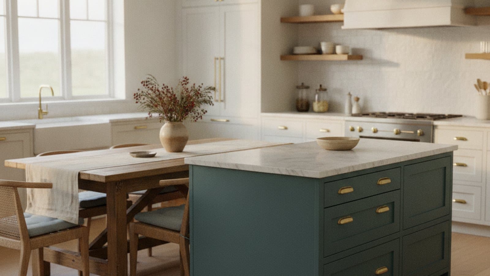
Refinishing your kitchen cabinets is one of the highest-impact updates you can make, which is exactly why the color choice feels so high-stakes. The paint will be on those doors for years, in the room you use most, so a shade that looks trendy today but tired in two seasons is a real risk. The good news is that timeless does not mean boring, and choosing a color that lasts is more about method than luck.
This guide walks through the cabinet color families that have staying power, how undertones and your existing finishes should steer the choice, why sheen matters as much as color, how Georgia daylight and kitchen lighting shift what you see, and the one step that prevents most regret: testing samples on the actual doors before you commit.
Start with color families that have staying power
The colors that age well tend to read as intentional rather than of-the-moment. Warm and soft whites are the safest anchor: they brighten a kitchen, make it feel larger, and pair with almost any countertop or floor. The key is choosing a white with a hint of warmth rather than a stark, cool white, which can feel clinical under Georgia sun and clash with warm wood floors.
Greiges, the family that sits between warm gray and beige, are the workhorse neutral for cabinets. They carry more depth than a plain white without pulling attention, and they hide everyday kitchen life a little better than a bright white does. For homeowners who want warmth without committing to a strong color, a soft greige is hard to beat.
If you want color with longevity, look to muted deep greens and blues. A grayed-down sage or forest green, or a soft slate-to-navy blue, reads as classic rather than trendy because those tones have shown up in kitchens for generations. Black and charcoal work beautifully too, but usually as an accent, on an island, a lower run, or a pantry, rather than wrapping the whole room, where they can close the space in.
The two-tone island, done tastefully
The two-tone kitchen, a lighter color on the perimeter cabinets and a contrasting tone on the island, has stuck around because it solves a real problem: it adds depth and a focal point without committing the entire room to a bold color. Done with restraint, it still looks current and it photographs well, which matters if resale is on your mind.
The way to keep it timeless is to let the perimeter carry the neutral (a soft white or greige) and reserve the stronger color for the island. A muted green, a slate blue, a warm charcoal, or a natural wood tone on the island gives you personality in a spot that is easy to repaint later if your taste shifts, without redoing the whole kitchen.
Where two-tone goes wrong is high contrast for its own sake, or picking two colors that do not share an undertone. If the perimeter white leans warm and the island leans cold, the pairing feels off even when each color is fine on its own. Keep the undertones in the same family and the two-tone look reads as designed, not accidental.
Coordinate with your countertops, backsplash, and floors
Cabinets do not live in isolation. The most common reason a cabinet color misses is that it fights the finishes already in the room, the countertops, backsplash, and flooring that are staying put. Before you fall for a color, pull it against those surfaces and see whether they agree or argue, because those elements are usually far more expensive to change than the cabinet color.
Countertops set the tone. A granite with warm brown and gold flecks wants a warmer cabinet color, while a cool gray quartz sits more comfortably with a crisp white or a cooler greige. Flooring works the same way: warm-toned wood or tile pushes you toward warmer cabinets, and a gray-washed floor gives cooler colors room to breathe. The goal is not matching, it is agreeing.
The backsplash is the tie-breaker. Because it sits directly between the counters and the cabinets, it is where clashing undertones show up most obviously. If your backsplash is staying, treat it as a fixed point and choose a cabinet color that flatters it. If it is changing too, coordinate the two together so the whole vertical surface reads as one intentional choice.
Undertones are what make or break the choice
Undertone is the quiet quality that decides whether a color feels right in your specific room, and it is where most cabinet color mistakes actually happen. Every white, gray, and greige leans slightly warm or cool, and that lean is far more visible on a big run of cabinets than it ever is on a small paint chip. A white that looked clean on the card can turn faintly pink, yellow, or blue once it covers every door in the kitchen.
The practical rule is to keep the cabinet undertone in the same temperature family as the finishes that are staying. Warm floors, warm counters, and warm light call for a cabinet color with a warm undertone; cool grays and stainless-heavy kitchens can carry a cooler one. Mixing a cool-undertone cabinet with warm wood floors is a classic source of that vague feeling that something is off, even when you cannot name it.
Undertones also shift with what sits next to them. A greige can look almost taupe beside a warm counter and almost gray beside a cool one. This is why comparing a color in the room, against the actual surfaces, beats trusting the name on the swatch. The undertone you get is the one your kitchen reveals, not the one on the label.
Choose the right sheen for cabinets
On cabinets, sheen is a durability decision as much as a look. A flat or matte finish shows every fingerprint and cannot really be scrubbed, which is a problem on surfaces you touch dozens of times a day around handles and the sink. At the other extreme, a high gloss wipes clean easily but magnifies every imperfection in the door and every brush or roller mark, so it demands a flawless surface underneath.
For most kitchens, a satin or semi-gloss cabinet-grade finish is the practical middle ground. Satin gives a soft, furniture-like glow that hides minor surface flaws while still wiping clean, and semi-gloss leans a little harder-wearing and easier to scrub, which suits busy family kitchens. Both stand up to the daily handling that cabinets take far better than a wall-style flat paint would.
The color and the sheen work together. A deep green or charcoal can look richer in satin, while a soft white often carries a semi-gloss well on doors that get constant contact. Whatever you choose, a cabinet-grade product in the right sheen, applied over proper prep, is what gives painted cabinets that smooth, made-to-last finish rather than a coat that chips at the handles within months.
How lighting and Georgia daylight change cabinet color
A cabinet color is not one color, it is a range that shifts with the light hitting it. The same door can look warmer at midday, cooler in the morning, and different again under your kitchen bulbs at night. This is not a flaw in the paint, it is simply how light works, and it is why a color chosen under a store fluorescent so often surprises people once it is on their own doors.
Georgia daylight is a real factor here. A kitchen with big south or west-facing windows gets strong, warm afternoon light that can push a cool white to look creamy or pull a gray toward beige by late day. A north-facing kitchen gets cooler, steadier light that can make warm colors read more muted. The direction your windows face should nudge your choice: lean slightly cooler in a bright, warm, sun-filled kitchen, and slightly warmer in a shaded, north-facing one.
Artificial light matters just as much, because a kitchen is used morning and night. Warmer bulbs make warm cabinet colors glow and can dull cooler ones, while cooler, daylight-style bulbs do the opposite. The reliable move is to look at your color under the actual bulbs you live with, at the times of day you actually use the kitchen, before you decide.
Test samples on the actual doors, not just a chip
The single step that prevents most cabinet color regret is also the simplest: try the color in your kitchen before you commit the whole room to it. A paint chip is far too small, and it is usually seen flat against a card rather than upright on a door in your own light. Colors behave differently at scale and vertically, so a chip is a starting point, not a decision.
Put real samples where they will live. Sample the color on a cabinet door or a large sample board you can hold against the doors, view it in the daytime and at night, and move it around the kitchen, next to the counter, beside the backsplash, near the window, and in the darker corners. Leaving samples up for a few days lets you see the color in every kind of light your kitchen throws at it before you are locked in.
This is also a good moment to narrow a wide field down to a confident choice. Most people start with several contenders and let the room eliminate the ones that go pink, muddy, or cold in their specific light. When one color still looks right morning and night, against the finishes that are staying, you have found the one that will keep looking right long after the job is done.
Resale-friendly versus bold: matching the choice to your plans
How long you plan to stay should shape how far you push the color. If a sale is anywhere on the horizon, lean toward the broadly loved neutrals, warm and soft whites and quiet greiges, which read as clean and move-in ready to the widest set of buyers. Neutral cabinets rarely make anyone hesitate, and they let a buyer picture their own kitchen without mentally repainting first.
If this is your forever kitchen and you want it to feel like yours, there is room to be bolder, as long as you are bold in a lasting way. The muted deep greens, slate blues, and charcoals hold up precisely because they are grounded rather than loud. A grayed, classic version of a color ages far better than a saturated, of-the-moment one, so you can have color and still avoid the trendy trap.
A smart compromise is to put the personality where it is easy to change. Keep the perimeter cabinets neutral and let an island or a single run carry the stronger color, so a future refresh, or a future buyer, only has to rethink a small piece rather than the whole kitchen. That way you get a kitchen that feels like yours now and stays easy to update later.
Frequently asked questions
- What cabinet colors will not go out of style?
- Warm and soft whites and quiet greiges are the most timeless, because they read as intentional rather than trendy and pair with almost any counter or floor. Muted deep greens and blues, and black or charcoal as an accent, also age well because those grounded tones have been used in kitchens for generations.
- How do I match my cabinet color to my countertops and floors?
- Coordinate by undertone rather than trying to match exactly. Warm counters and warm wood floors call for a cabinet color with a warm undertone, while cool gray quartz or a gray-washed floor sits better with a crisp white or cooler greige. Since counters, backsplash, and floors are expensive to change, let them steer the cabinet color.
- What sheen is best for kitchen cabinets?
- A satin or semi-gloss cabinet-grade finish is the practical choice for most kitchens. Flat finishes cannot be scrubbed and show fingerprints, while high gloss magnifies every flaw. Satin gives a soft, furniture-like look that hides minor imperfections, and semi-gloss is a little tougher and easier to wipe clean around handles and the sink.
- Why does my cabinet color look different in my kitchen than on the sample?
- Color shifts with light and scale. Big south or west-facing windows in a Georgia kitchen push warm afternoon light that can make a cool white look creamy, while artificial bulbs change it again at night. A small chip seen flat also reads differently than a full run of doors, which is why testing in the room matters.
- Should I choose a bold cabinet color or play it safe for resale?
- It depends on your plans. If a sale is on the horizon, broadly loved neutrals like warm whites and greiges appeal to the most buyers. If it is your long-term kitchen, muted deep greens, slate blues, and charcoals let you add character in a lasting way, and putting the bolder color on an island keeps a future update easy.
Related services
Serving
Ready for an exact price?
Get a free, no-pressure in-home estimate. Real numbers for your home, not a phone guess.